Member since Aug 1997
Shop Note Type: General
Disclaimer!
I am not a photography nor photo editing expert. If you have any photo editing knowledge, this note may add nothing of value. It is directed to beginners and novices using a free tool, so that there is no outlay to cover occasional needs.
The Objective
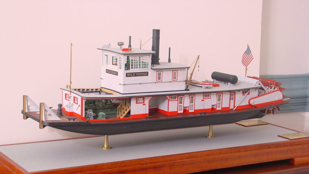
Far too many ship model photos fail to do justice to the fine work of the model maker. After spending hundreds of hours on a model, you owe it to yourself to put it in its best light. That starts with the photography itself, which is outside the scope of this note. Look online or in books and magazines for tips related to lighting, depth of field (if your camera supports it), and shooting angles. Once the photo is taken, you may find that it falls short of your expectations in one way or another. First, try retaking the photograph, if you can. Even then, technical limitations may require some touching up. Hopefully this note will help in that regard.
Which Program?
In this age, where household AI is taking off, it begs the question, why learn a tool? Well, for now, what AI assistance you can get for free is limited, as is the resolution of the returned images. Even when AI is doing the work for you, it never hurts to understand a bit of what is going on under the hood. But in the later sections, I will touch briefly on where AI can help the most
There are many photo editors out there. The flagship program is PhotoShop, but it currently costs $23 per month. GIMP is a popular open-source free editor which I’ve only looked at briefly. I recently learned of a free browser-based app called Photopea that is billed as a lightweight substitute for PhotoShop. For the purposes of this shop note, I will be using FastStone. Not because it is better; I don’t even recall why I selected it years ago. I think I found it’s menus easier to navigate, and it’s batch editing features suited me. I will those toward the end
FastStone may or may not be inferior to the previously mentioned programs in one or more ways, but I’ve found it suits nearly all of my needs. As a means for describing a few basic techniques, the program does not matter, as they all have similar commands. Once you learn and understand the commands in one program, it is usually only a matter of finding where (in often complex menus) the equivalent command resides. If there are any minor differences in the command structure, it shouldn’t take long to get accustomed to them.
I will not take the time to introduce all the commands and where to find them in FastStone. I’ll leave it to you to explore, seach the documentation, or do web queries for those answers. I will point out that when in full screen mode, different menu options appear when you move your mouse to the left, right, top, and bottom edges. I will also point out where key commands are to be found. OK! Let’s dig in!
Color Models
It’s worth starting with a brief overview of the two color models, additive and subtractive.
The Additive Color Model
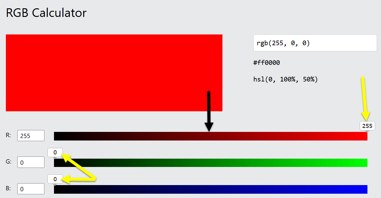
The additive model produce shades from black to white by adding varying luminosities of three primary colors: red, green, and blue (RGB). With no luminosity at all, you see black. By adding full luminosity of each, you see white. This is the model used for electronic devices such as a computer monitor. A useful tool for experimenting with this is the W3 Schools RBG calculator.
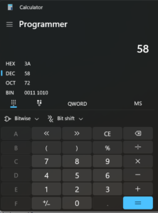
You’ll note that the ranges are from 0 to 255. Why? Because computer data is stored in groups of 8 digits, each a one or a zero. This is the base-2 numbering system. In this system, each extra digit added to the right multiplies the previous by 2. Compare this to the standard base-10 system where each digit multiplies the previous by 10:
1, 10, 100, 1000, 10000
56 x 10 = 560.
0 = 0 in base 10
1 = 1 in base 10
10 = 2 in base 10
100 = 4 in base 10
1000 = 8 in base 10
111 = 7 in base 10
11111111 (8 ones) = 255 in base 10
Thus, there are 255 increments of luminosity in a standard computer color representation.
You can put your Windows calculator app into Programmer mode to convert between the two numeric bases.
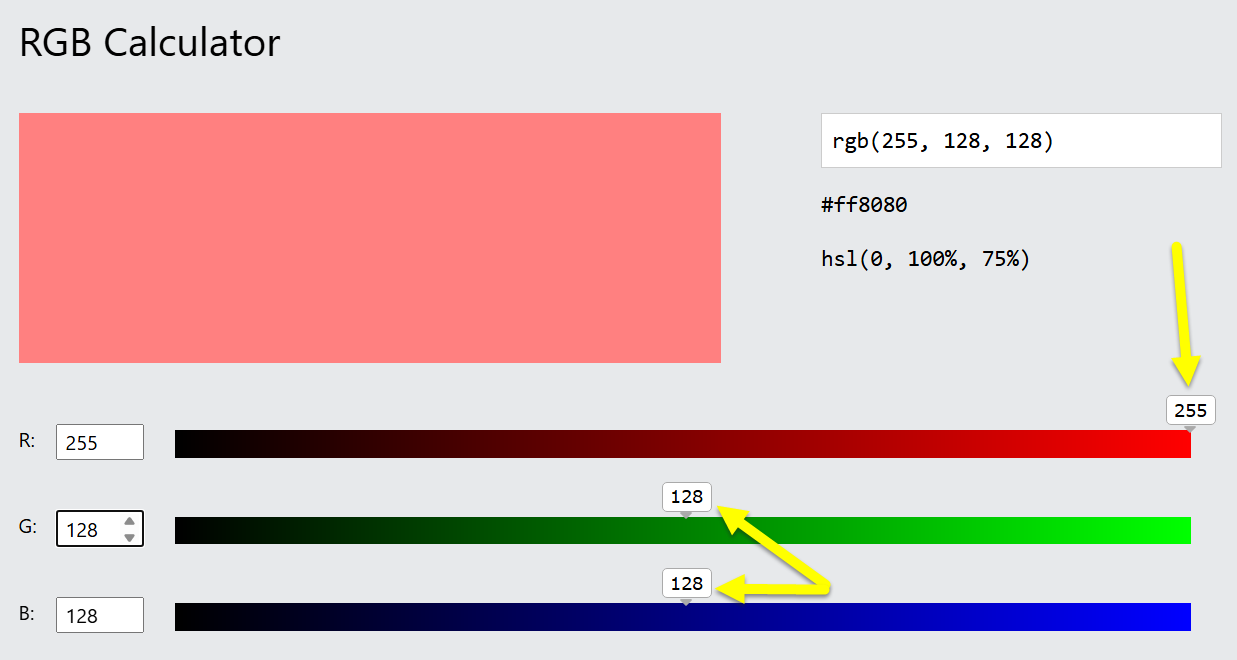
Here are two examples. On the left, the red luminosity is set to 255 (100%) and the green and blue luminosities are at 0%, yielding pure red. Note the color range is from black to pure red, not white to pure red. Liken this to a room with white walls and a pure red light on a dimmer switch. Turn the dimmer all the way down, and the room is black. Turn the dimmer all the way up, and the wall will be red – we’ve added red (additive model). When you have the dimmer half way, the room is dark red, not pink. Pink would be approaching white, and as we turn up the dimmer, we are approaching red. All three channels at 100% yield pure white, so to get pink you would add half of the other two channels. That is the image to the right.
The Subtractive Color Model
The subtractive color model produce shades from white to black by subtracting varying amounts of the same three primary colors. This is the model that applies to paints. Cyan pigments absorb red light and reflect green and blue, which we perceive as cyan. Yellow pigments absorb blue light and reflect green and red, which we perceive as yellow. Magenta pigments absorb green light, reflecting red and green, which we perceive as magenta. The initials for these pigments comprise the name for the CMY scheme. As pigments are not perfect and do not absorb all of the primary color, paint manufacturers add some true black to compensate. To avoid confusion with blue, the letter k is used in place of b, resulting in the CMYK color scheme. W3 schools also has a CMYK tool. It is seldom used for digital images and only included here to complete our understanding.
Though delivered with a slightly pedantic tone, this video provides an enlightening demonstration of both the additive and subtractive models.
Hue / Saturation / Brightness (HSB)
We’re actually going to start at the complicated end and dumb it down afterward. This will ensure a solid understanding of what the simpler controls are doing, and this will help you use them more effectively.
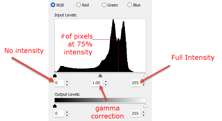
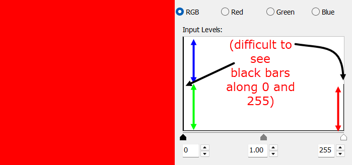
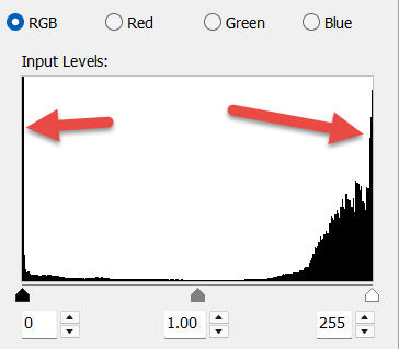
The Histogram
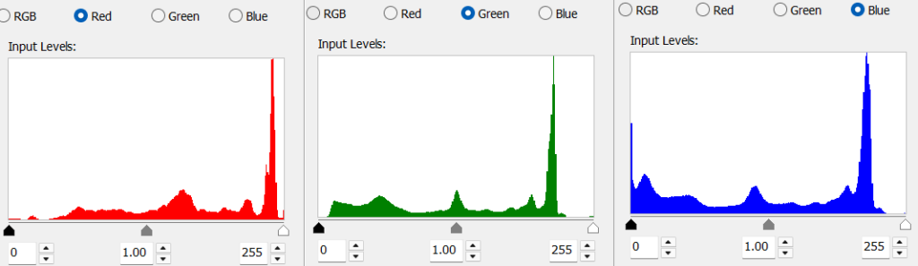
The source of all truth is the historgram. There are four channels: RGB, Red, Green, and Blue.
The horizontal axis shows the levels of luminosity from 0 to 255, as described in the Additive Color Model section. The vertical axis shows the number of pixels at each level of luminosity.
Below is a histogram of a true photographic example. The region to the right represents highlights. The region to the left represents shadows. This histogram shows a bunching to the right of center, meaning the image is bright over all, or at the very least, brighter than medium gray. The gap at the right shows that there are no pixles of any color in at the upper end of the luminosity range. This means there are no pure whites, contrast is lower than the maximim possible, and the image will appear slightly muted. The left side shows there is a small number of pure black pixels (all three color channels at zero) and a rapidly increasing number of pixels that are close to black (sum of all three channels close to zero). The flat line section to the right indicates that the dark tones are evenly distributed in the shadows. The gamma correction control is indicated, but will be discussed later.
The RBG channel shows the pixels of all colors combined at each level of luminosity. In a 20 x 20 image the number of pixles is 400. Each color is represented, so the total count of measurments is 1200. As an illustration, take this pure red square. Although there are no blue or green pixels of any luminosityat all, they are counted as zeros. So 2/3 of the histogram is bunched on the left. All of the red pixels are 100% luminosity, so they appear on the right, but the bar is only half as high as it is at zero, as the 400 red pixels are only 1/3 of the total count.
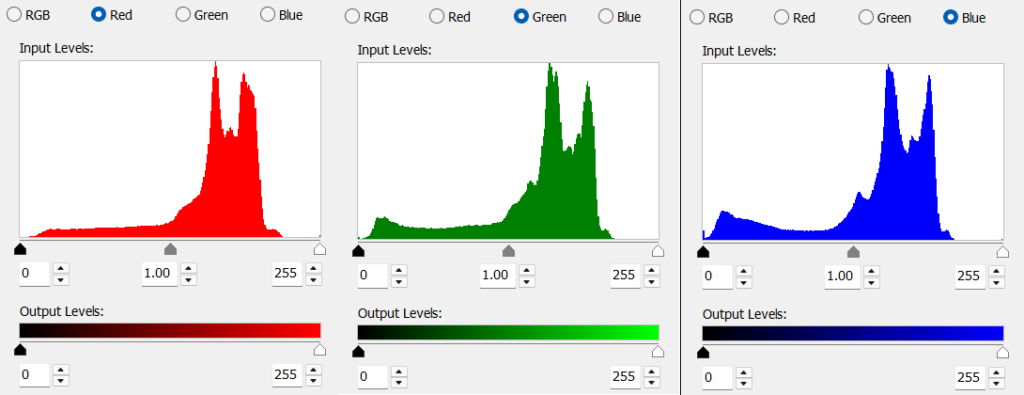
The red, blue, and green channels show the luminosity variation within each specific color. As mentioned, the aggregate is reflected in the RGB field. While the distributions are similar, you can see the slight variations. When manipulating the RBG channel, you are making the same change to all three color channels – the color luminosities will change equally and the color balance remains the same. By manipulating the color channels independently, you can balance the colors. This one is balanced, but muted.
Levels
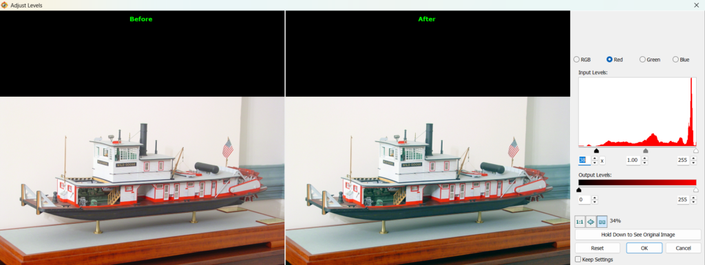
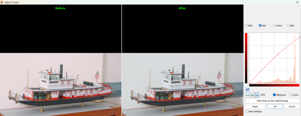
The histograms shown above are found in the Levels control. Often, the first adjustment to be made is balancing the colors and the contrast. The photo below has a noticeable red tinge and looks flat.
You can see it in the historgram: the red channel shows more luminosity than the blue and green channels. Here is where we start introducing the controls. If you move the slider on the right toward the center of the historgram, you are instructing the program to make everything at the new position and to the right of it 100% luminosity. The red channel already has pixels at 100%, so it does not need to be adjusted.
The brighest green pixel is about 90% luminosity. If we move the slider to the right edge of the current distribution, we are saying make the pixels at that position 100% luminosity. This will temporarily make the image look yellow (red and gree = yellow).
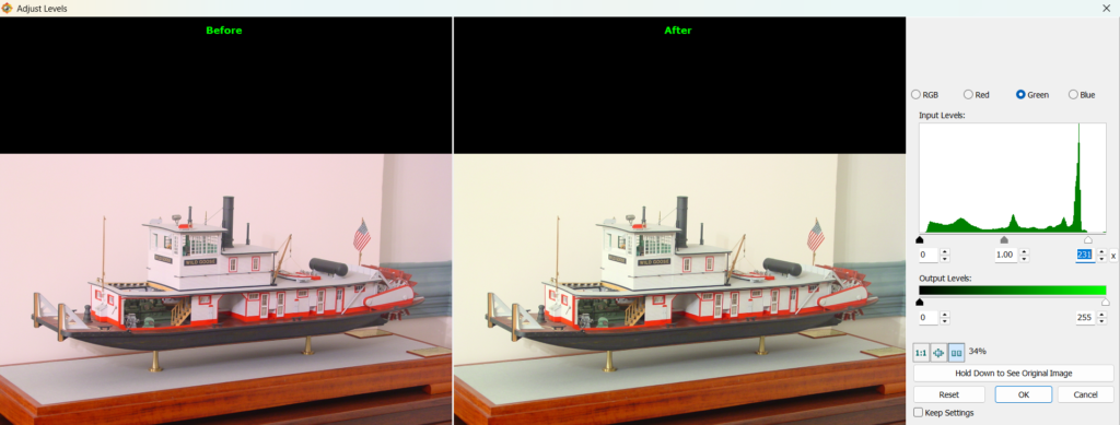
If we do the same to the blue channel, everything becomes balanced and what was originally tinged with red now appears white. Notice the image is also brighter.
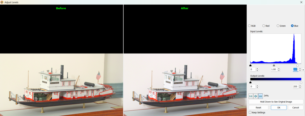
Now let us examine the low luminosity range. The blue channel has many dark pixels, so it needs no adjustment. The red channel has a few zero luminosity pixels, but the entire range from 0 to approximately 10% has very few. This means that all you will see is grey tones. If the object is truly gray, then this is perfect. But if the object is darker than the image appears, we can fix it in a similar manner to what we did at the opposite end. When we move the left-hand slider in to approximately the 10% position, we are indicating that all of the pixels that were between 0 and 10% luminosityshall now be 0% luminosity. When we adjusted the highlights, we did not move the slider past any existing pixels, meaning only the most luminous pixels were set to 100%. In this example, I am choosing to make some of the barely bright pixels black for the sake of darkening the shadows. A small amount of detail will be lost, but the image will be better for it. If you don’t like the results, you can slide it back to the left whatever amount it takes to make the image as pleasing to you as possible.
We will now do the same to the green channel, but stop at the least luminous existing pixel, as the range of dark green pixels is already pretty good except at the exteme end.
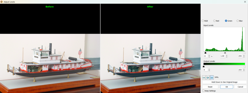
With these changes, the red tinge has disappeared, the whites look whiter, and the blacks look blacker. Because the pixels are spread out from 0 to 100% instead of 5 to 90%, the image has more contrast (less wash, more punch).

We still have not talked about gamma. We’ll get to it later.
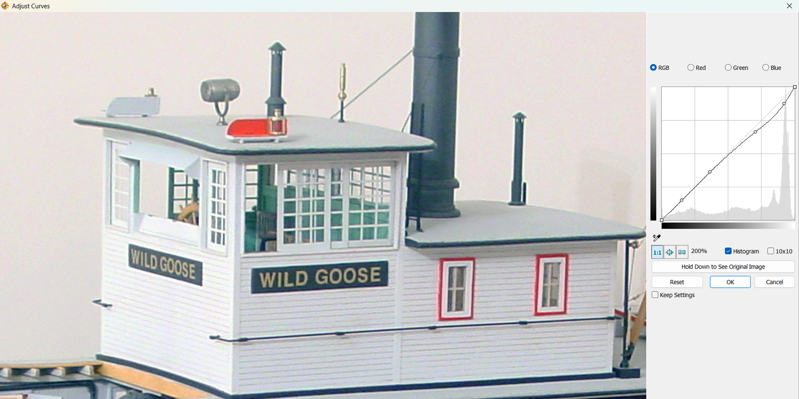
Curves
Curves are more powerful levels. The adjustments we made using the Levels control were linear – the values were stretched a consistent amount over the entire range. If, for example, the original range was from 10 to 90%: what was 10% becomes 0%, what was 30% becomes 25%, what was 50% stays 50%, what was 70% becomes 75%, and what was 90% becomes 100%. It is impossible to change one part of the image without affecting the rest.
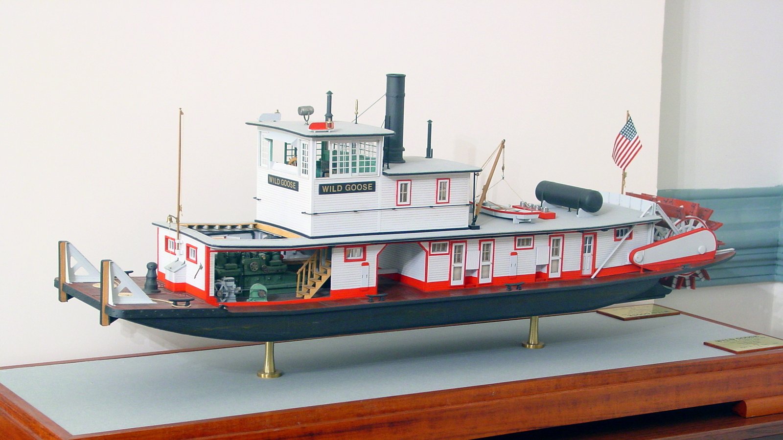
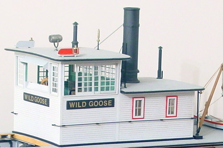
The Curves control allows one to make non-linear adjustments. Using it, we can adjust only a portion of the image, leaving the remainder unaffected. Continuing the previous example, while the image was improved the highlights are a bit “blown out”. The process is analgous to drafting splines and ducks, with which many ship modelers will be familiar. In FastStone, you click on the curve to add a control point and right click on a point to remove it. Other programs may be slightly different. To lock the shadows in place, click on points at approximately 13, 38, and 63%. Then click the line at around 88% (or perhaps where the largest spike is), and drag it down slightly. Notice that the rest of the line remains the same. What we are doing is lowering the luminosity of the pixels near the top end, but without darkening the lightest pixels or any of the midtones and shadows. Observe the effect. Vary the point at which you drag downward and the extent to which you move it. You can also drag the nearest anchor down a little bit (less than the other) to smooth the transition and affect a bit of the midtones. It is very much trial and error, but you will get a feel for what changes create certain effects. In this example, note the additional detail visible, particularly surounding the “WILD GOOSE” signs and the awning above the window.
Common Curves Adjustments
Highlight Recovery Curve
Recover detail in bright areas. This is the example given previously.
- Optional: Click one or more times left of the top-right corner to protect midtones
- Click near the top-right corner → drag slightly down
- Effect: Reduces over-bright areas without touching shadows or midtones
- You can punch up highlights, if appropriate, by dragging up instead of down
- Compare to the Highlights slider control introduced later
Shadow Lift
Recover detail in dark areas.
- Optional: Add one or more points just above the bottom left to protect midtones.
- Click near the bottom-left → drag slightly up.
- Effect: Lifts shadows gently without brightening the rest of the image.
- You can push details into the shadows by dragging down instead of up.
- When to use: Only if Shadows slider (introduced later) doesn’t give enough control.
Gentle S-Curve
(contrast boost)
This is a combination of Highlight Recovery and the opposite of Shadow Lift. It adds subtle pop by darkening shadows and brightening highlights.
- Click near the bottom-left corner (shadow region) → drag slightly down
- Click near the top-right corner (highlight region) → drag slightly up
- Effect: Shadows deepen, highlights brighten, midtones stay mostly unchanged
- Small movements only
(contrast reduction / flattening)
This is a combination of opposite of Highlight Recovery and Shadow Lift. It can recover some detail at both ends of the range with minimal effect on the midtone by decreasing contrast. Detail will only emerge if enough pixels exist throughout the range in question (low or high). If the pixels are bunched at the ends, this will not help.
- Click near the bottom-left corner (shadow region) → drag slightly up
- Click near the top-right corner (highlight region) → drag slightly down
- Effect: Shadows lighten, highlights dim, midtones stay mostly unchanged
- Small movements only
Midtone Lift / Lower
Brighten or darken the image subtly without blowing out highlights.
- Optional: Add one or more points near the top-right to hold highlights in place.
- Click in the middle of the curve → drag slightly up.
- Effect: Image gets lighter; shadows and highlights mostly unchanged.
- When to use: If Brightness slider (introduced later) washes out highlights, this is safer.
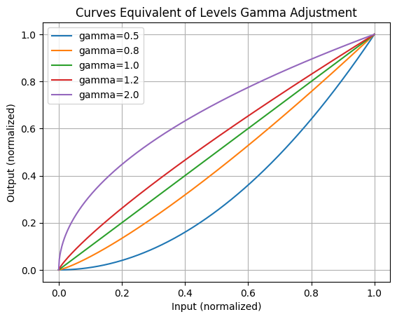
This is a good place to introduce the gamma slider from the Levels control. The gamma slider raises or lowers the curve in the middle, as discussed in this section, but along a mathmatically precise path. It affects the midtones, the most, followed by the low luminosity range, with the least effect in the high luminosity range.
Color Correction
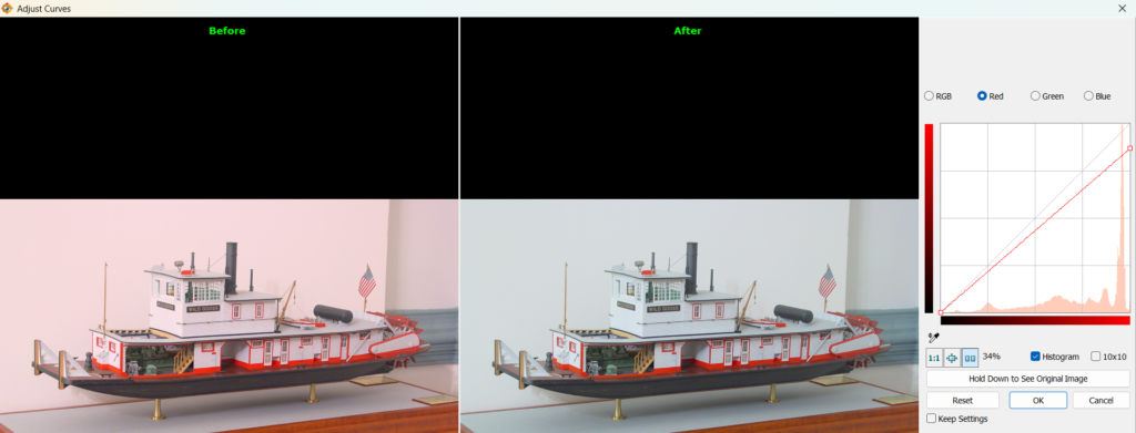
The changes above assumed use of the RGB channel. But the same changes can be made on an individual channel. This can be helpful if the image has a color tinge and you don’t want to make the other two channels brigher by adjusting the Levels. Instead, you can lower the luminocity of the offending color in Curves by sliding the end of the curve down the right-hand side. This applies a linear reduction of that color across the entire range. If the color distribution looks appropriate in the highlights but still has a the same color cast overall, you can lower the color in the mid tones by pulling slightly down in the middle. Add a control point to near the right to lock in the highlights, if it helps. It might be difficult to determine the range producing the cast, so experimentation is the order of the day.
On the other hand, if after adjusting the highlights you start to see a cast of a different color, the correction in the mid tones was too much. As before, you can add an (optional) control point near the right hand side to lock in the highlights. In this case, pull slightly up on the middle to remove some of the correction in the mid tones. In the example below, removing the red in the highlights produced a green cast (probably cyan from relatively stronger blue and green). The result was subtly improved by pulling up in the middle.
Slider Controls
Now that you understand how the image is represented by the pixels’ color, luminosity, and distribution, we can introduce some simplified, and sometimes more powerful, controls without glossing over what they are doing.
Highlights
I use this control more than any other, which indicates that most photos I take or receive from club members are over exposed. If your camera has an exposure control, try taking photographs with it set to -1 stop or more, depending on the ambient light.
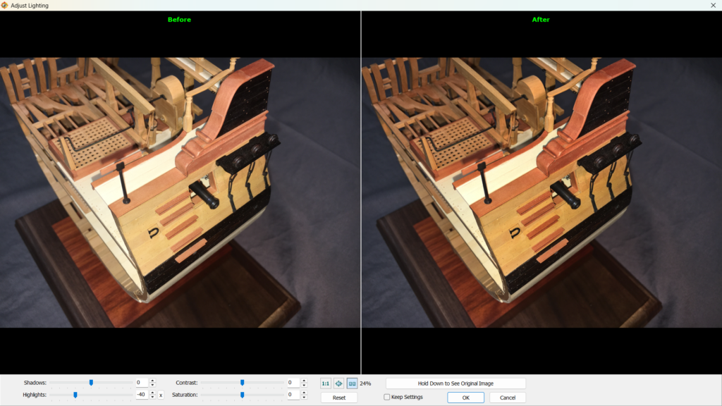
The highlight slider, an easier and safer version of the Highlight Recovery proceedure discussed under Adjust Lighting, can be found in FastStone in the left-hand menu under Adjust Lighting. You can be fairly agressive with this control. In this example, I’ve lowered the highlights to -40 without darkening the image too far. Note that only the bright areas are noticeably affected. The bright white holly of the deck is not as washed out and the beautiful pear on the hull has a much richer appearance. All or most of the improvement possible by adjusting the curves is achieved with must less thought or effort. Naturally, you can move the slider to the positive side of zero to brighten the highlights if the appear too muted.
Shadows
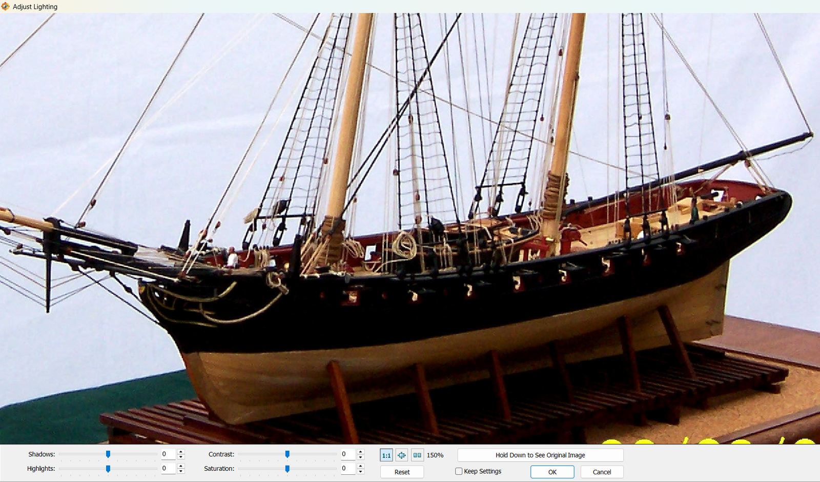
The mirror control to Highlights is Shadows, also found in the left-hand menu under Adjust Lighting in the left-hand menu. Just as Highlights is the equivalent of the Highlight Recovery proceedure, Shadows is the equivalent of Shadow Lift. Move the slider to the right to recover detail from overly dark areas, or to the left to darken areas that need more contrast, all without affecting the midtones or highlights noticeably.
In this example, the beakhead is lacking detail and the hull is heavily shadowed below the turn of the bilge. Moving the slider to the right makes the entire beakhead more visible and the lower hull is not heavily shaded.
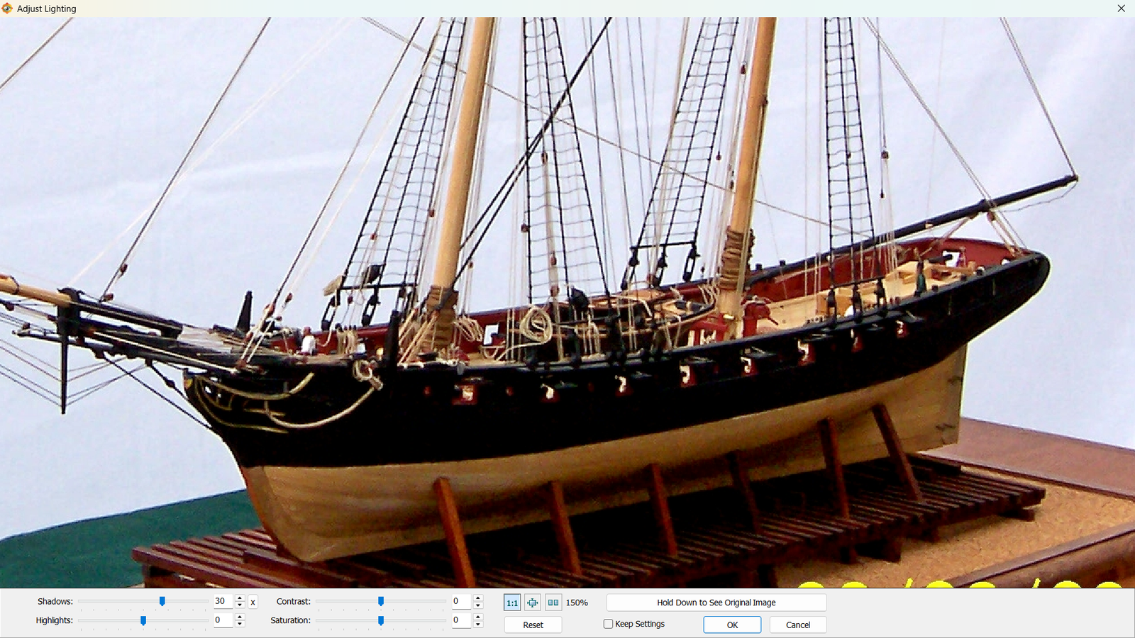
Nothing can be done to pull detail from the hull above the waterline. One interpretation of a histogram not mentioned earlier is the significance of a spike on the left or right side. The term is “clipped”. A spike on the left means that an excess number of pixels are completely black and detail in the shadows will be missing, like on this black hull. A spike on the right means that an excess number of pixels are fully white and details will be missing in the highlights, like in bright clouds or sails. This image has both, but the blown out highlights are simply the background. The deep valley between the two spikes indicates very few midtones – overall, the image is either very dark or very light. In other words, it has far too much contrast. The data is just not there to recover it by redistributing the range using any of the tools discussed so far.
Contrast
The contrast control is the slider equivalent of the Gentle S-Curve workflow discussed in Curves, which was described as a combination of Highlight Recovery and Shadow Lift. It is also therefore a combination of the Highlights slider and the Shadows slider. I prefer to use those to together rather than the contrast control.
In FastStone, Contrast is found in both the Adjust Lighting and Adjust Colors in the left-hand menu.
Saturation
According to my research, shadow lifting may introduce dull, muddy colors and a subsequent saturation increase can improve perceived detail and distinguish black from brown, for instance. Though I have not saved any changes I’ve made with this control, I have experimented with it. My only conclusion is that anything more than a very slight increase makes the image look artificial. That might be fun artistically, but in model making we are more interested in reaslism.
If you wish to experiment with it, you’ll find it in Adjust Lighting or Adjust Colors when using FastStone.
Brightness
This control is found under Adjust Colors in the left-hand menu of FastStone.
Brightness adds luminosity across the entire range of the image. When raising it, it will quickly blow out highlights or push detail into the shadows. If your image needs to be made lighter or darker overall, you can start with this control. Stop before highlights are clipped or significant shadow detail is lost. Ar that point, use the highlight, shadow, and gamma controls to further refine light areas, dark areas, and midtones, respectively.
Gamma
See the MidTone Lift proceedure under Common Curves Adjustments in the Curves section. This control is found under Adjust Colors in the left-hand menu of FastStone.
Red / Green / Blue
These channels change the the lumunosity of a particular channel across the entire range. When a color is decreased, it is the same as moving the right-hand point of a color-specific curve (in Curves) down the vertical axis. When increasing the color, it is the same as moving the left-hand point up the vertical axis. These controls are sometimes useful if there is still a cast remaining after adjusting Levels, but you can get more precise control using Curves.
FastStone users will find these controls under Adjust Colors in the left-hand menu.
Hues
Think of every color as having a position on a circle:
- red → orange → yellow → green → cyan → blue → magenta → back to red
The Hue slider shifts every color along that circle by the same amount. If you move the Hue slider:
- red objects might become orange or magenta
- blues might become cyan or purple
- greens could shift toward yellow or teal
This is of more use in a creative setting. It is rarely, if ever, applicable to touching up a ship model photograph. But if you wish to experiment within FastStone, it is also under Adjust Colors in the left-hand menu.
Backgrounds
I saved the trickiest for last.
Part of setting up a good photograph is choosing an appropriate setting. Far too many model photos are taken with busy backgrounds. An ounce of prevention is worth a long ton of cure. Do what you can to minimize background clutter and distracting hard edges, and take a huge burden off your editing. But if you run into limits, or if the photo is already taken and can’t be recreated, these tips will help.
Cropping
The easiest thing you can do is crop whatever is outside the area of interest. It won’t often be that easy, and you may have to compromise on what areas of the subject are included, but always start with the simple approach. A side benefit is that the model will be a larger percentage of the image and therefore have more “pop”.
Clone / Stamp
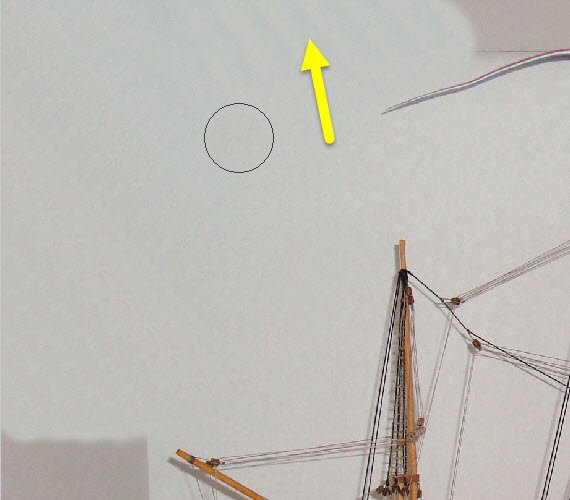
Aside from AI, this will be be your best friend for fixing what a simple crop cannot. Notice the hard edges in the background of this photograph. We’d like to get rid of them, and the means to do that is the Clone / Stamp tool. In FastStone, this is the Clone and Heal command, found in the left-hand menu. There is an option at the top to switch between clone and heal, but I have only ever used Clone.
This control copies one area of the photo and pastes it into another area, but blends them together in the process. The amount of blending is controlled by the hardness setting and the size of the area copied is controlled by the size property.
Step 1 – Size the area to the amount desired. Larger areas are easier to blend, but when you get near the model you will often need to reduce the size
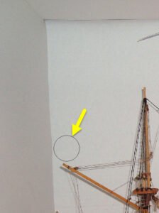
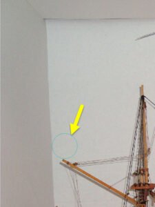
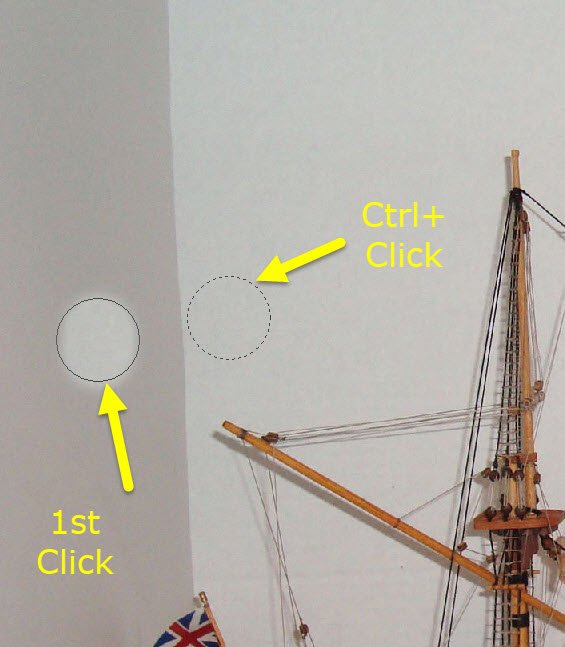
Step 2 – Position the mouse in the region you wish to copy and Ctrl + click. The color of the circle will shift when you press Ctrl. When you right-click, you establishes the “source” position. For a seamless color transition, the location you click should be relatively close to where you want to paste
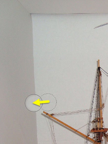
Step 3 – Move the cursor to where you want to paste (the “target”) and click. The source will be pasted to the target location.
Step 4 – Optionally, continue clicking to paste repeatedly from the same relative distance. As you move the mouse, the source position moves with it. The relative offset from source to target will be the same until you do another Ctrl+Click. I have done a different Ctrl-Click for the series of images below compared to those above, so do not be confused by the change in relative distance.
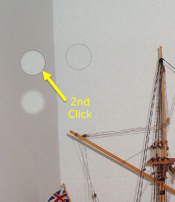
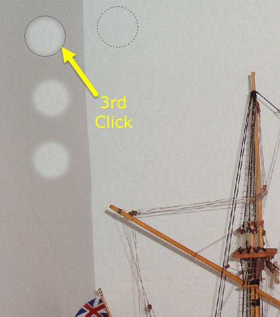
- In practice, your clicks will not be spaced as shown above, but overlapping to create a continuous field.
- If you start to see areas with faint striping, it helps to copy (new Ctrl+click wiht larger offset) from a more uniform area and then Ctrl+click again to resume with a smaller offset.
- You can click and drag for continuous clone + paste.
- Ctrl+click again when you need to change the offset direction
- When you reach an edge
- When you encounter an obstacle, such as the ship’s mast
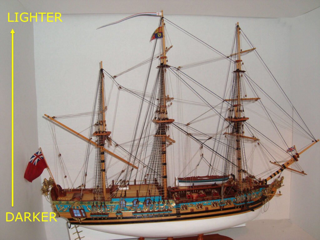
- Reduce source size when in tight areasAvoid continuous copying in the direction of shadow change. In the example above, if you clone + paste vertically, you will drag the light area at the top into the dark area at the bottom and eventually create a hard edge someqwhere. In this example, work from side to side as much as possible.
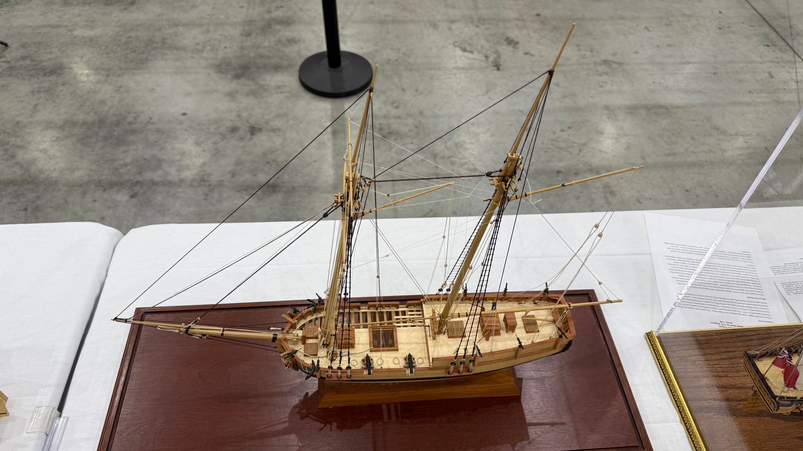
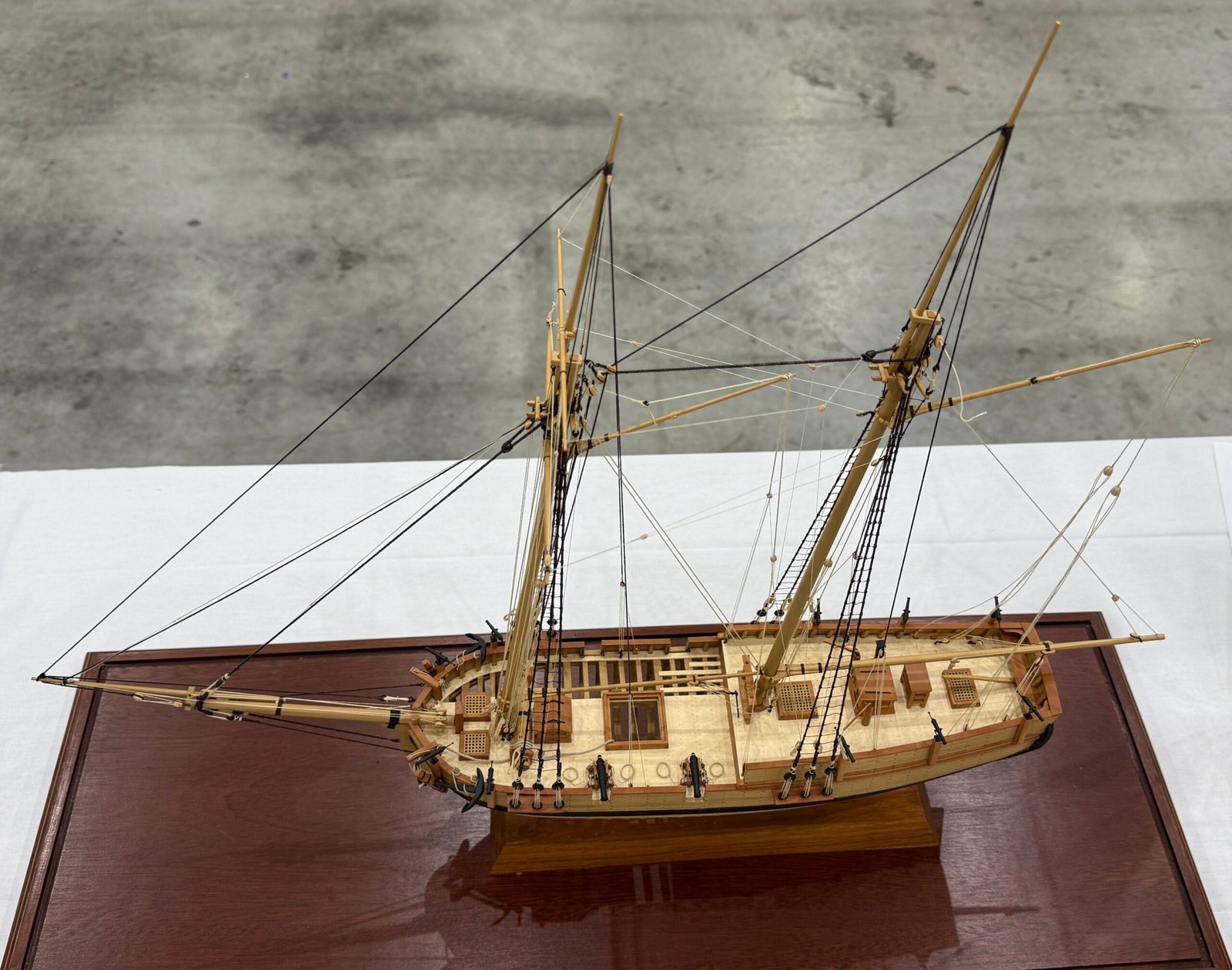
Here is another example showing the benefits of both cropping and cloning. Note the distracting objects to the left and right were cropped out of the image, and the post in the background was remove by cloning the adjacent pavement and stamping it on top of the post. The edge of the tablecloth was also hidden by the clone and stamp tool.
Artificial Intelligence
This is where AI does things so much faster and better than by hand. Depending on the image, clone + stamp can be quick and easy, or a major undertaking. Imagine trying to clone stamp amongst all that rigging! An online AI agent created the image below is seconds. The only downside is that the image resolution was greatly reduced and the image was given a watermark (which I removed with clone + stamp. Both of these limitations can be avoided by using a paid service, which I did not.